Undertones Of Urbane Bronze
Undertones of urbane bronze have become a popular choice in modern interior design, offering a rich, sophisticated aesthetic that balances warmth and neutrality. This versatile color draws attention for its ability to complement a wide range of materials, textures, and lighting conditions. Urbane bronze carries subtle undertones that can shift depending on its environment, appearing warmer or cooler based on natural or artificial light. Designers and homeowners alike appreciate its depth, understated elegance, and timeless appeal, making it a favored option for both contemporary and traditional spaces. Understanding the nuances of urbane bronze is essential for creating harmonious interiors that highlight its full potential and enhance the ambiance of any room.
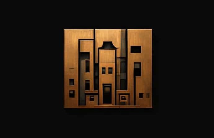
Understanding Urbane Bronze
Urbane bronze is a deep, muted shade that combines elements of brown, gray, and a hint of metallic warmth. Its understated richness allows it to function as a neutral base while providing a sense of depth and sophistication. Unlike standard browns or grays, urbane bronze offers subtle complexity through its shifting undertones, which can appear cooler in shadowed areas and warmer in direct light. This duality makes it highly adaptable in interior design, enabling it to harmonize with a variety of color palettes and decorative styles.
Color Characteristics
- Deep, muted tone that serves as a neutral yet distinctive shade.
- Contains both warm and cool undertones that change with lighting conditions.
- Pairs well with metallic finishes, wood textures, and natural stone surfaces.
Psychological and Emotional Impact
Colors like urbane bronze can influence mood and perception within a space. Its warm undertones evoke a sense of comfort and stability, while the cooler hints add calm and sophistication. This balance makes it ideal for environments where both relaxation and productivity are desired. Urbane bronze can create a welcoming atmosphere in living rooms, bedrooms, and offices, encouraging focus and contemplation without overwhelming the senses. Its timeless appeal also conveys a sense of refinement and understated elegance, making it a popular choice for high-end interiors.
Creating Mood with Urbane Bronze
- Warm undertones foster comfort and coziness.
- Cool undertones enhance sophistication and modernity.
- Combining urbane bronze with complementary accents can further emphasize desired moods, such as tranquility, luxury, or energy.
Complementary Colors and Palettes
Urbane bronze is highly versatile when it comes to color coordination. Its subtle undertones allow it to pair well with both muted and vibrant shades, enabling designers to craft visually appealing and balanced compositions. Neutral colors such as beige, cream, and soft gray can create serene, monochromatic schemes, while bold accents like deep teal, mustard yellow, or burnt orange introduce contrast and visual interest. Metallic elements like brass, copper, or matte black further enhance urbane bronze, adding layers of texture and depth to a space.
Suggested Pairings
- Neutrals Cream, taupe, soft gray for a calming, balanced palette.
- Accent Colors Deep green, navy blue, or burnt orange for contrast and richness.
- Metallics Brass, copper, and black finishes to enhance elegance and sophistication.
Lighting and Undertone Effects
Lighting plays a crucial role in how urbane bronze appears in a room. Natural light brings out its warmer undertones, highlighting subtle golden or brownish hues. In contrast, artificial lighting, particularly cooler LED lights, may emphasize the gray or muted bronze aspects of the color. Understanding how lighting interacts with urbane bronze is key to achieving the desired effect in a space. Designers often recommend testing paint samples in multiple lighting conditions before making final decisions, ensuring that the color performs as expected throughout the day and evening.
Practical Lighting Tips
- Observe the color in both natural and artificial light to understand its shifting undertones.
- Use layered lighting, including ambient, task, and accent lighting, to highlight the depth of urbane bronze.
- Consider reflective surfaces like metallic fixtures or glossy finishes to enhance warmth or create contrast.
Applications in Interior Design
Urbane bronze is a versatile choice for a variety of interior design applications. It works well on walls, cabinetry, furniture, and decorative elements, creating a cohesive and sophisticated environment. In living spaces, urbane bronze can serve as an accent wall or backdrop for artwork, while in kitchens and bathrooms, it complements stone countertops, tile finishes, and metal fixtures. Its neutrality also makes it suitable for commercial spaces, including offices, hotels, and retail environments, where it conveys professionalism and timeless elegance.
Use Cases
- Walls and Ceilings Adds depth and warmth to main living areas or bedrooms.
- Cabinetry and Furniture Enhances the sophistication of kitchens, bathrooms, or office spaces.
- Decorative Accents Throws, rugs, cushions, and curtains in urbane bronze provide subtle elegance.
- Commercial Interiors Creates a refined and welcoming atmosphere in professional settings.
Design Tips for Balancing Undertones
When working with urbane bronze, attention to undertones is critical to achieving a harmonious interior. Pairing it with materials and finishes that complement its warmth or coolness can enhance visual cohesion. For example, wood elements can accentuate warmth, while stone and metal finishes can highlight cooler nuances. Additionally, layering textures, such as plush fabrics, natural fibers, and metallic surfaces, adds dimensionality and richness, making the color feel intentional and integrated rather than flat or overwhelming.
Practical Design Advice
- Test samples in multiple lighting conditions to understand undertone shifts.
- Combine with textures that enhance either warmth or coolness depending on design goals.
- Use complementary colors strategically to maintain visual balance and interest.
- Incorporate accent pieces in metallics, natural materials, or bold colors to break monotony.
Understanding the undertones of urbane bronze is key to leveraging its full potential in interior design. Its unique combination of warm and cool nuances makes it adaptable, sophisticated, and timeless. By considering lighting, complementary colors, textures, and materials, designers and homeowners can create spaces that are both visually appealing and emotionally resonant. Whether used as a primary color or an accent, urbane bronze offers depth, elegance, and versatility, making it a valuable choice for any design scheme. Appreciating its subtleties allows for intentional design decisions that elevate a room’s atmosphere, resulting in interiors that are stylish, balanced, and enduring.