Example Of Bar Graph
Bar graphs are one of the most commonly used tools in data visualization, allowing individuals to present information in a clear and easy-to-understand manner. They are particularly effective for comparing different categories or tracking changes over time. By using rectangular bars to represent data values, bar graphs provide a visual way to quickly interpret complex information. Whether in business reports, educational settings, or scientific research, bar graphs help convey trends, patterns, and differences in a visually appealing format. Understanding examples of bar graphs can help learners and professionals alike grasp the importance of data presentation and make informed decisions based on visualized data.
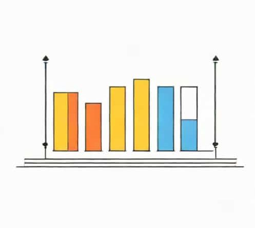
Understanding Bar Graphs
A bar graph consists of a series of bars, each representing a different category or value. The length or height of each bar corresponds to the data it represents. Bar graphs can be drawn vertically or horizontally, depending on the preference and the type of data. Vertical bar graphs are often used for comparing categories, while horizontal bar graphs are helpful when category names are long or when comparing many items. Key components of a bar graph include the title, axes, bars, labels, and sometimes a legend to explain different colors or patterns used in the bars.
Types of Bar Graphs
Bar graphs come in various types, each suitable for specific purposes. Common types include
- Simple Bar Graph Represents data for one category or variable.
- Grouped Bar Graph Shows multiple sets of data for comparison across categories.
- Stacked Bar Graph Displays multiple values stacked on top of one another to show total and individual contributions.
- Horizontal Bar Graph Useful when category labels are long or to display comparisons in a horizontal layout.
Examples of Bar Graphs
Examples of bar graphs can be found in educational studies, business reports, government publications, and everyday life. They help simplify complex data and provide clear insights. Here are a few illustrative examples
Example 1 Student Performance
A school might create a bar graph to compare student performance in different subjects. The categories could be subjects such as Mathematics, Science, English, and History. The bars would represent the average scores in each subject. A vertical bar graph would quickly show which subjects students excel in and which require more attention. For instance, if the Mathematics bar is the highest and History the lowest, educators can prioritize additional support in History while acknowledging strengths in Mathematics.
Example 2 Monthly Sales Report
Businesses often use bar graphs to present monthly sales data. Each bar represents sales revenue for a specific month, with higher bars indicating months with better sales. A company can quickly identify trends, such as peak sales periods or months with declining revenue. For example, a bar graph showing January to December sales allows managers to compare performance throughout the year and make informed marketing or inventory decisions. This is a classic example of how bar graphs simplify business analytics and decision-making processes.
Example 3 Population Comparison
Government agencies frequently use bar graphs to display population data. For instance, a bar graph may compare the population of different cities or regions. Each bar represents a city, and the height of the bar corresponds to its population size. This visual representation makes it easier for policymakers and the public to understand demographic distributions. An example might show City A with 1 million residents, City B with 500,000, and City C with 750,000. The differences are immediately apparent, facilitating resource allocation and urban planning.
Example 4 Survey Results
Surveys often use bar graphs to present responses to multiple-choice questions. For example, a survey asking Which type of transportation do you use most frequently? may include categories such as Car, Bicycle, Bus, and Walking. The bars show the number of respondents choosing each option. This example illustrates how bar graphs help summarize survey data efficiently, providing a clear picture of trends and preferences. Analysts can then use this information for planning, policy-making, or marketing purposes.
Advantages of Bar Graphs
Bar graphs offer several benefits that make them popular for data presentation
- Easy to read and interpret, even for people without statistical training.
- Visually highlights differences and trends among categories.
- Flexible format, allowing vertical or horizontal bars based on space and preference.
- Can represent both discrete and continuous data effectively.
- Useful for comparisons, trend analysis, and performance tracking.
Tips for Creating Effective Bar Graphs
To ensure a bar graph communicates data effectively, several best practices should be followed
- Include a clear and descriptive title explaining what the graph represents.
- Label axes accurately with units where applicable.
- Maintain consistent intervals and scaling to avoid misrepresentation.
- Use contrasting colors or patterns to differentiate multiple data sets.
- Avoid cluttering the graph with unnecessary information or overly complex designs.
Applications of Bar Graphs
Bar graphs are versatile tools used in multiple fields for decision-making, reporting, and education. In business, they track sales, expenses, and customer preferences. In education, they visualize exam results, attendance records, or participation in activities. In science, bar graphs help present experimental results and statistical comparisons. Governments use bar graphs for census data, public health statistics, and economic reports. In everyday life, individuals use bar graphs for personal budgeting, fitness tracking, or hobby-related data analysis.
Bar graphs are an essential tool for visualizing and interpreting data in a clear and concise manner. Examples of bar graphs, such as student performance charts, sales reports, population comparisons, and survey results, demonstrate their effectiveness in summarizing information for easy understanding. By following best practices and creating accurate and visually appealing bar graphs, individuals and organizations can communicate complex data efficiently. Understanding bar graphs and how to use them effectively enhances decision-making, supports analysis, and helps convey insights to a wide audience. Whether in education, business, or research, bar graphs remain a fundamental method for presenting data clearly and meaningfully.